ROLE
User Experience Designer
DURATION
Aug - Dec 2025
TEAM
Avani Chandorkar
Mandy Chiang
Haley Horton
SCOPE
Information Architecture
User Experience Research
User Experience Design
High-Fidelity Wireframes
Prototyping
Abstract
The Morgan Museum is located right in the heart of New York City - but is it just as easy to navigate online?
As the Morgan looks to strengthen its digital presence, this project reimagines its website to better support visitor needs and encourage meaningful engagement both on-site and online.
Project Goal
This project's goal was to explore how a museum website can better support meaningful visitor engagement with museums.
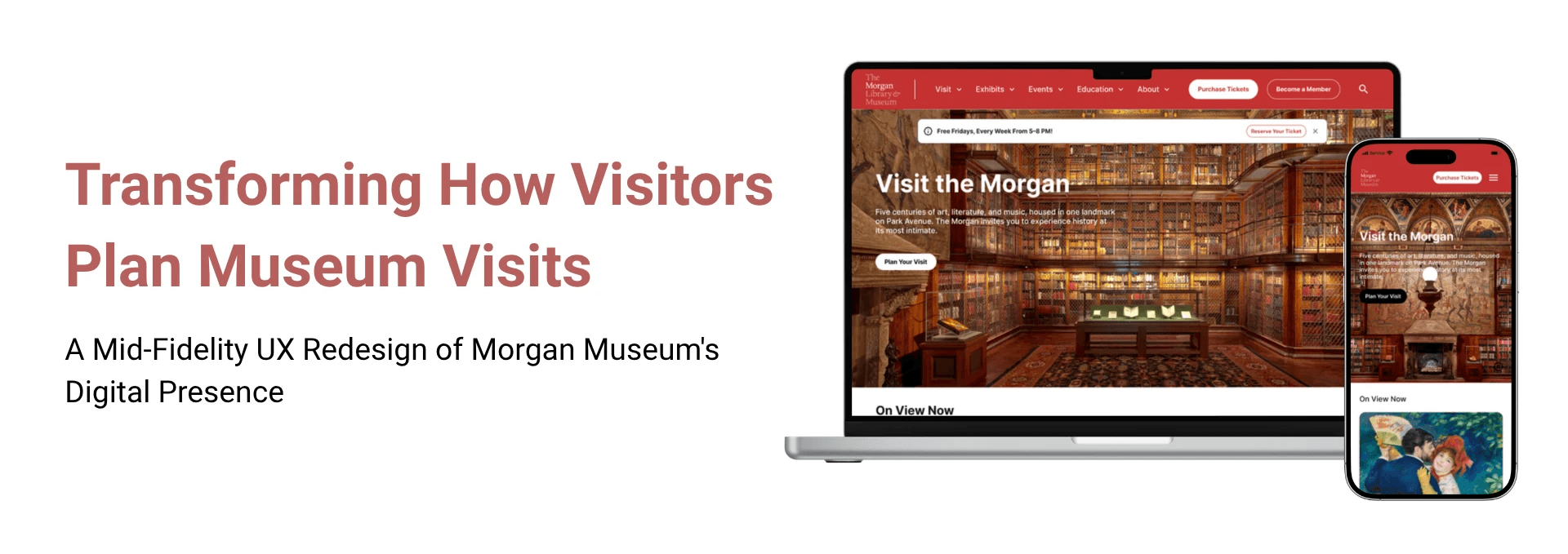
Here's a sneak peek! Swipe to compare the current website with the redesigned version.
1
RESEARCH
What matters most to museum visitors?
What we did:
selected participants via screener survey
interviewed 9 participants
identified insights through affinity diagramming
What we found:
9/9
users checked for ticketing information
6/9
users checked for operating hours beforehand
8/9
users checked for exhibits and related information
4/9
users preferred booking tickets online for special events.
Quick and easy access to all essential information
Users emphasized the importance of having easy access to essential information such as ticketing details, operating hours, and peak visitation times, when planning a museum visit. Many also agreed that they were more likely to visit by discounted tickets, but they preferred purchasing these tickets on-site, as they were often easier to find in person than online.

Clear details about exhibits
Users wanted clear exhibit details, as it helped them understand what they would see during their visit.
Hassle-free event registration
Users wanted an easy way to register for special events in advance, with clear event details and a smooth ticketing process.

How are other museums supporting visit planning?
What we did: competitive analysis with 8 competitors
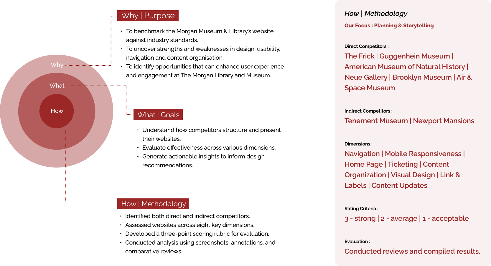
What we learned:

Does the Current Morgan Website Reflect These Patterns?
❌
2
APPROACH
How do visitors expect information to be organized?
What we did:
using UX Metrics:
card sorts with 8 participants
tree test
What we learned:
Takeaway 1:
Users think in terms of experiences, not categories. They look for “what to do” and “how to plan their visit.”
Takeaway 2:
Simplifying navigation improves confidence and exploration.
Takeaway 3:
Iteration through card sorting and tree testing helped us validate every decision with user input.
In the end, every label and path was shaped not by assumption, but by the people who will use it. We came up with the following site map for the website:
Turning insights into structure: reshaping the Information Architecture
Using these insights, we developed the information architecture, translating patterns into a clear and cohesive sitemap.


3
DESIGN
How does the redesign solve the problem?
The final designs translate our research and insights into a clear, intuitive experience that supports visitors at every step of planning their museum visit.
The final designs translate our research and insights into a clear, intuitive experience that supports visitors at every step of planning their museum visit.


Clear Information Architecture.
Simplified UX copy and information architecture to make it easier to understand.
Horizontal Scroll
Adding horizontal scroll in mobile flow with CTAs that automatically scroll to separate sections on content-heavy pages.

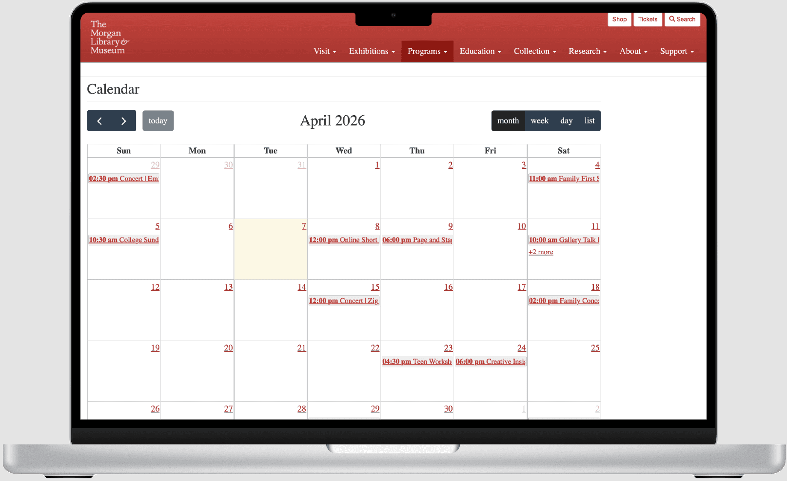


Intuitive Calendar.
Redesigning the calendar to show important information upfront, making the user experience more intuitive.
ROLE
User Experience Designer
DURATION
Aug - Dec 2025
TEAM
Avani Chandorkar
Mandy Chiang
Haley Horton
SCOPE
Information Architecture
User Experience Research
User Experience Design
High-Fidelity Wireframes
Prototyping
Abstract
The Morgan Museum is located right in the heart of New York City - but is it just as easy to navigate online?
As the Morgan looks to strengthen its digital presence, this project reimagines its website to better support visitor needs and encourage meaningful engagement both on-site and online.
Project Goal
This project's goal was to explore how a museum website can better support meaningful visitor engagement with museums.
Here's a sneak peek! Swipe to compare the current website with the redesigned version.
1
RESEARCH
What matters most to museum visitors?
What we did:
selected participants via screener survey
interviewed 9 participants
identified insights through affinity diagramming
What we found:
9/9
users checked for ticketing information
6/9
users checked for operating hours beforehand
8/9
users checked for exhibits and related information
4/9
users preferred booking tickets online for special events.
Quick and easy access to all essential information
Users emphasized the importance of having easy access to essential information such as ticketing details, operating hours, and peak visitation times, when planning a museum visit. Many also agreed that they were more likely to visit by discounted tickets, but they preferred purchasing these tickets on-site, as they were often easier to find in person than online.
Clear details about exhibits
Users wanted clear exhibit details, as it helped them understand what they would see during their visit.
Hassle-free event registration
Users wanted an easy way to register for special events in advance, with clear event details and a smooth ticketing process.
How are other museums supporting visit planning?
What we did: competitive analysis with 8 competitors
What we learned:
Does the Current Morgan Website Reflect These Patterns?
❌
2
APPROACH
How do visitors expect information to be organized?
What we did:
using UX Metrics:
card sorts with 8 participants
tree test
What we learned:
Takeaway 1:
Users think in terms of experiences, not categories. They look for “what to do” and “how to plan their visit.”
Takeaway 2:
Simplifying navigation improves confidence and exploration.
Takeaway 3:
Iteration through card sorting and tree testing helped us validate every decision with user input.
In the end, every label and path was shaped not by assumption, but by the people who will use it. We came up with the following site map for the website:
Turning insights into structure: reshaping the Information Architecture
Using these insights, we developed the information architecture, translating patterns into a clear and cohesive sitemap.
3
DESIGN
How does the redesign solve the problem?
The final designs translate our research and insights into a clear, intuitive experience that supports visitors at every step of planning their museum visit.
The final designs translate our research and insights into a clear, intuitive experience that supports visitors at every step of planning their museum visit.
Clear Information Architecture.
Simplified UX copy and information architecture to make it easier to understand.
Horizontal Scroll
Adding horizontal scroll in mobile flow with CTAs that automatically scroll to separate sections on content-heavy pages.
Intuitive Calendar.
Redesigning the calendar to show important information upfront, making the user experience more intuitive.